Branding, packaging, and environmental graphics for a beloved Chinese American hotspot in Manhattan.
The Bao is a popular downtown restaurant that has been servicing the Lower East Side for over 50 years. Bringing together traditional Chinese recipes and comforting American flavors, The Bao puts a fresh and sophisticated spin on takeout, and its identity needed to reflect this modern sensibility.
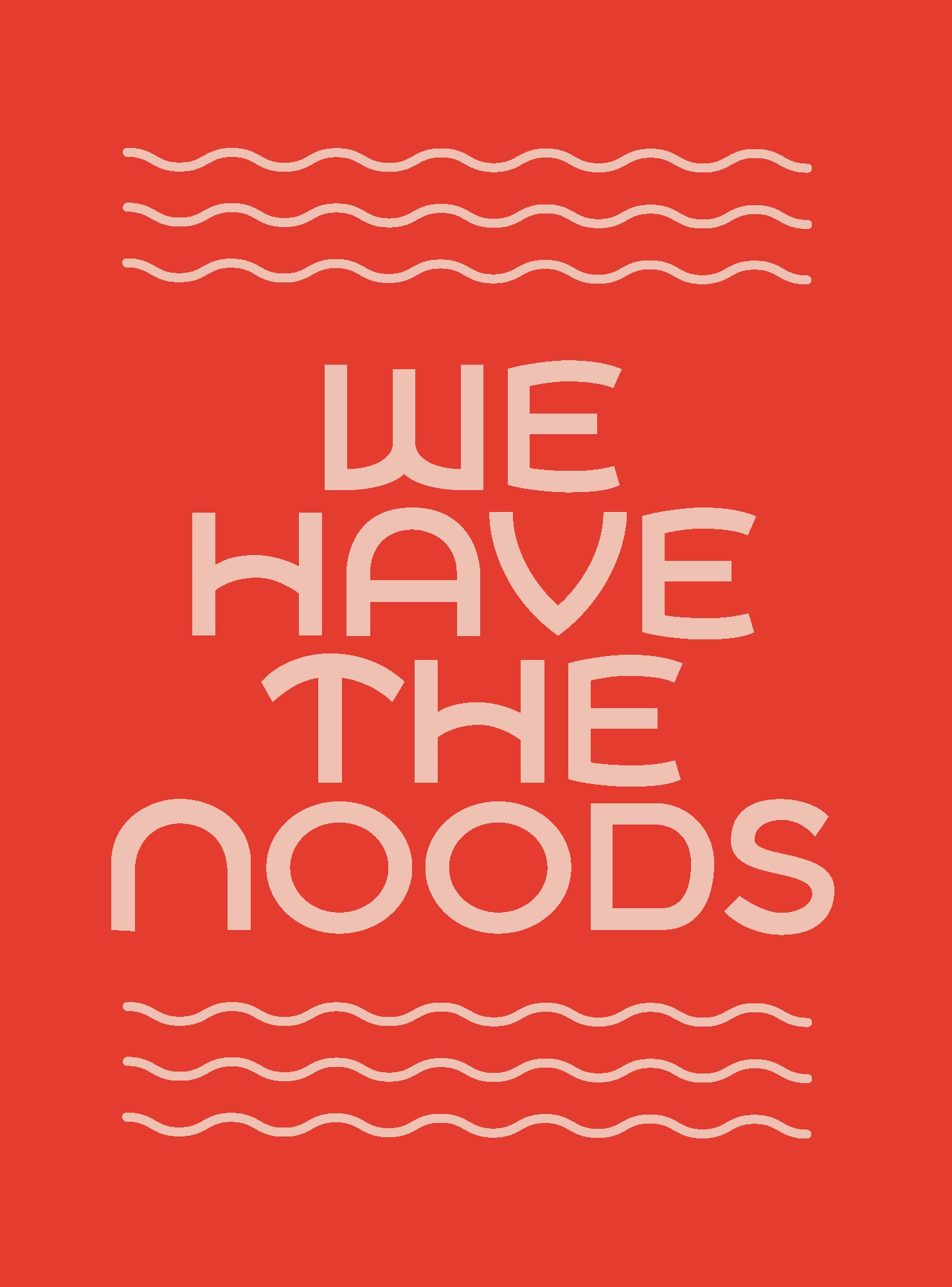
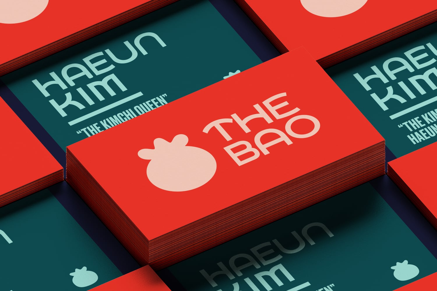
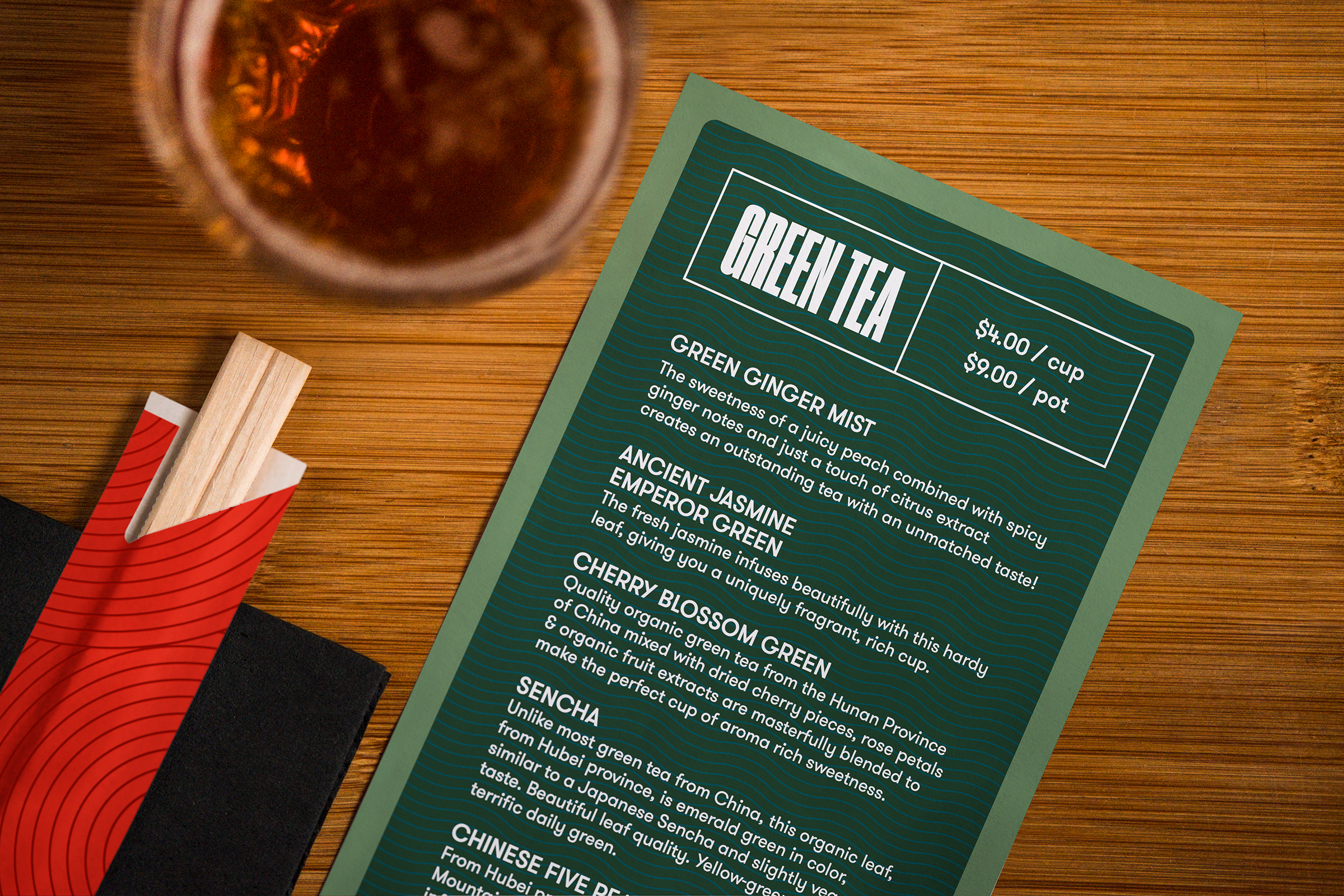
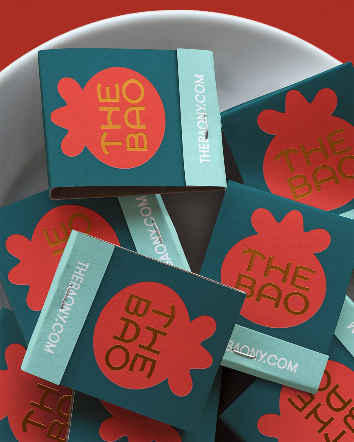
To connect the hotspot with a younger audience, I designed a complete identity for the eatery. The visuals were refreshed with bolder graphic patterns, cheeky copy, and colors that departed from the overused treatments of Chinese American restaurants.
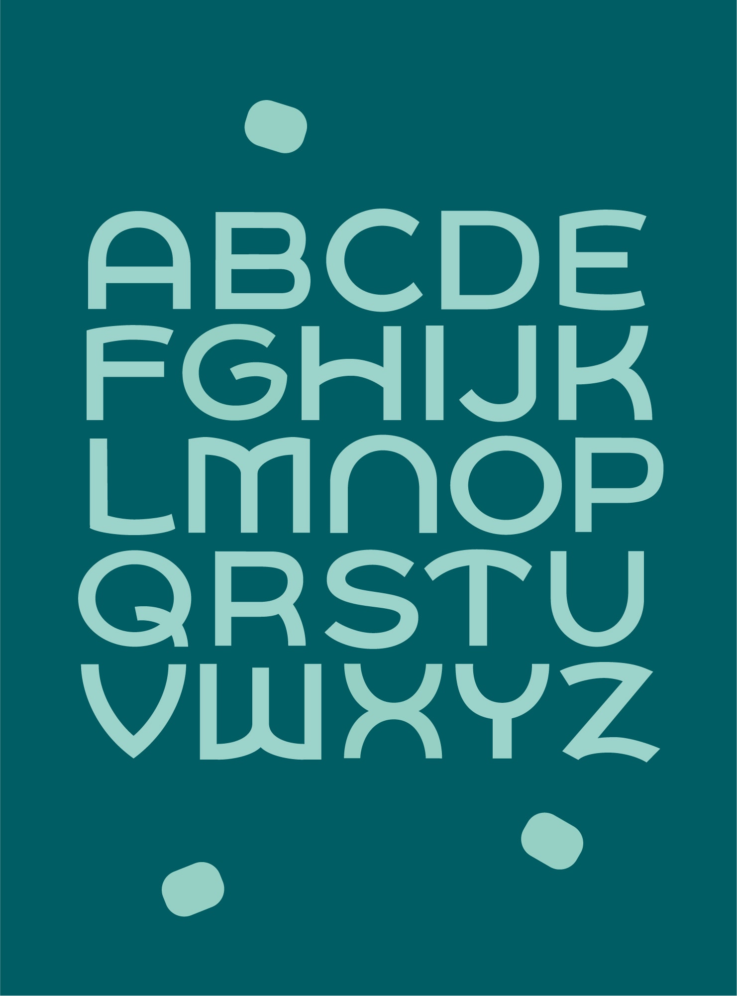
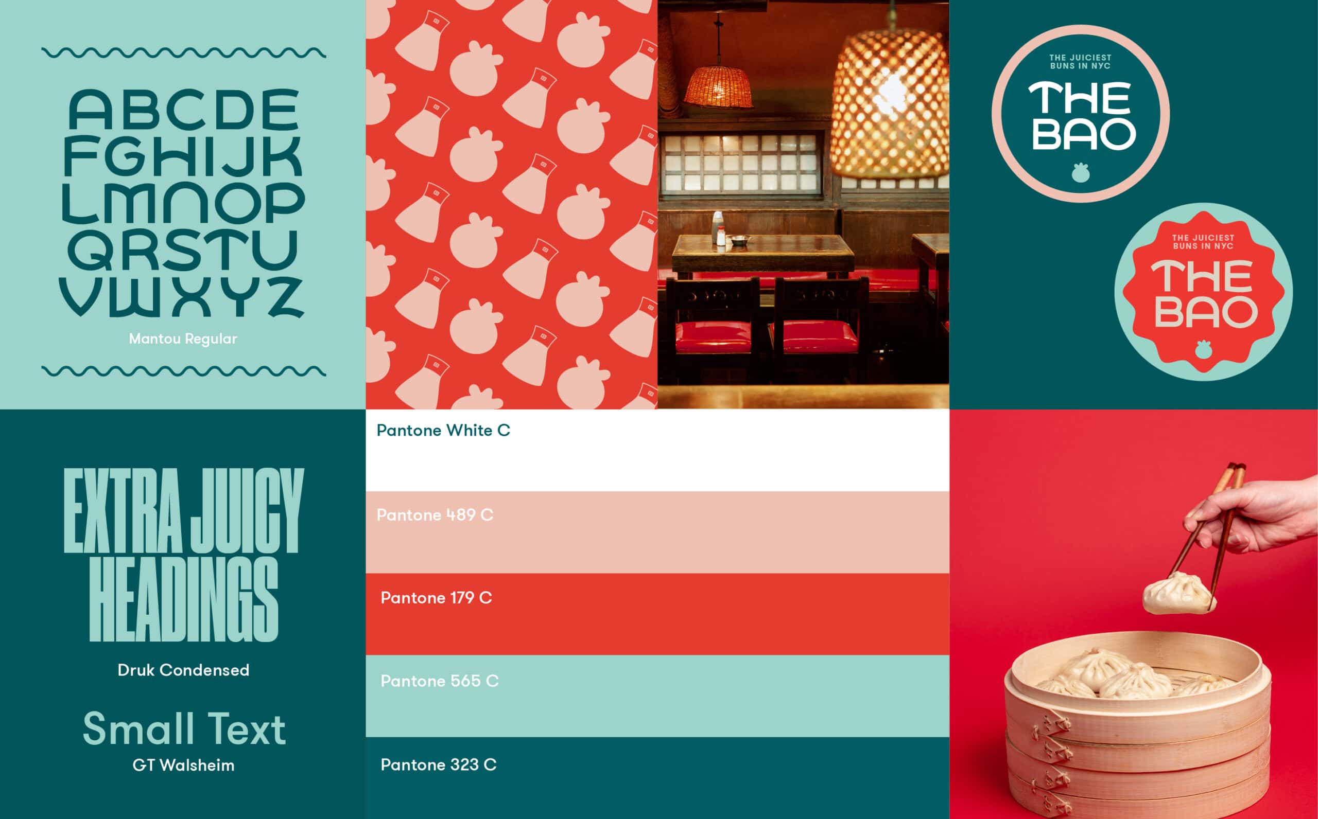
The typographic system for The Bao included a custom all-caps typeface, Mantou, whose letterforms are inspired by the curvilinear forms of the traditional Chinese steamed bun of the same name.
In addition to visual identity and environmental graphics, an ecommerce presence was developed for the brand to launch its line of frozen dumplings and sauces direct to customers around the country.
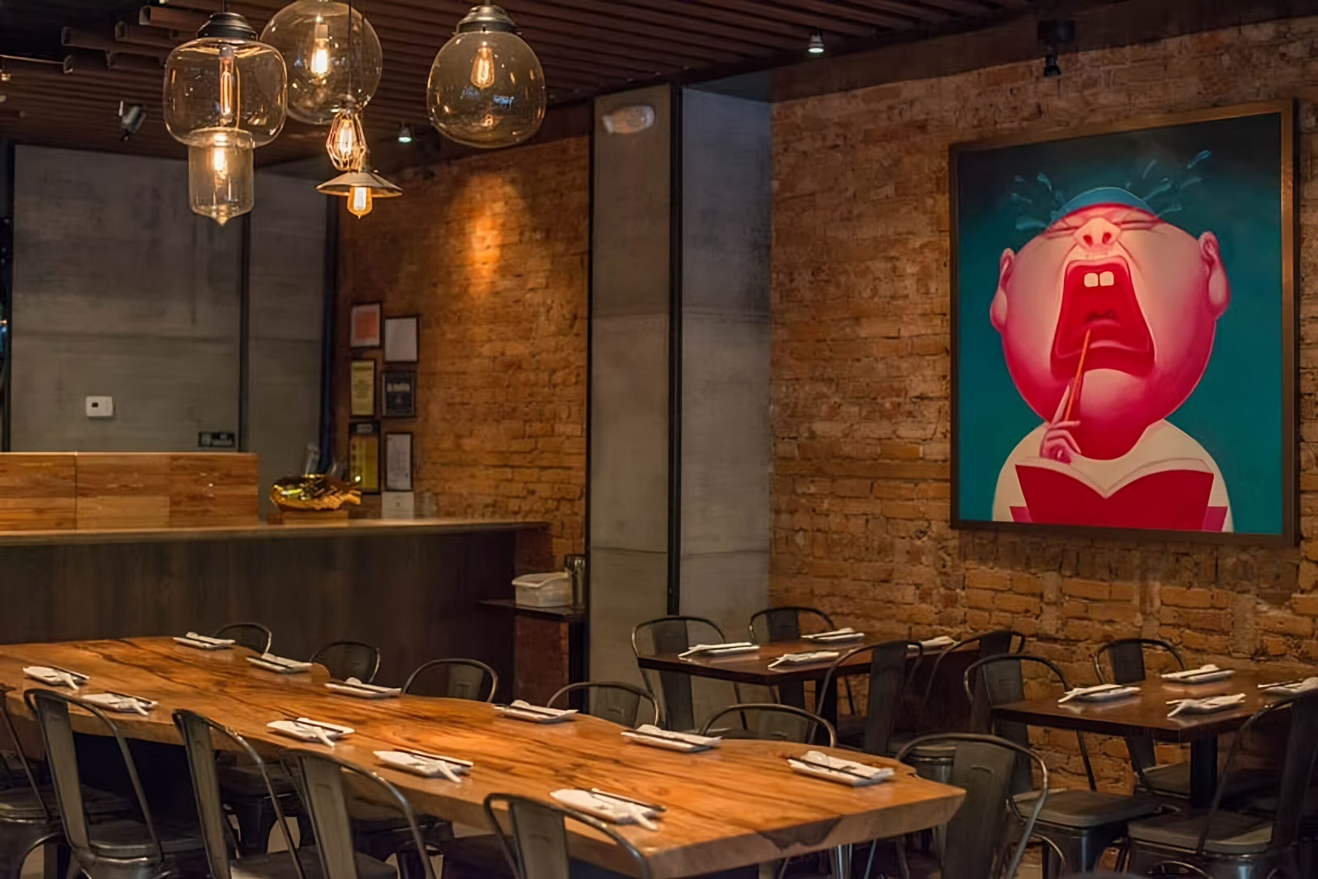
Since opening in the East Village in 2014, The Bao has hung a single print by Sichuan avant garde artist Yin Jun. This piece provides the palette for the refreshed colors in the brand system.
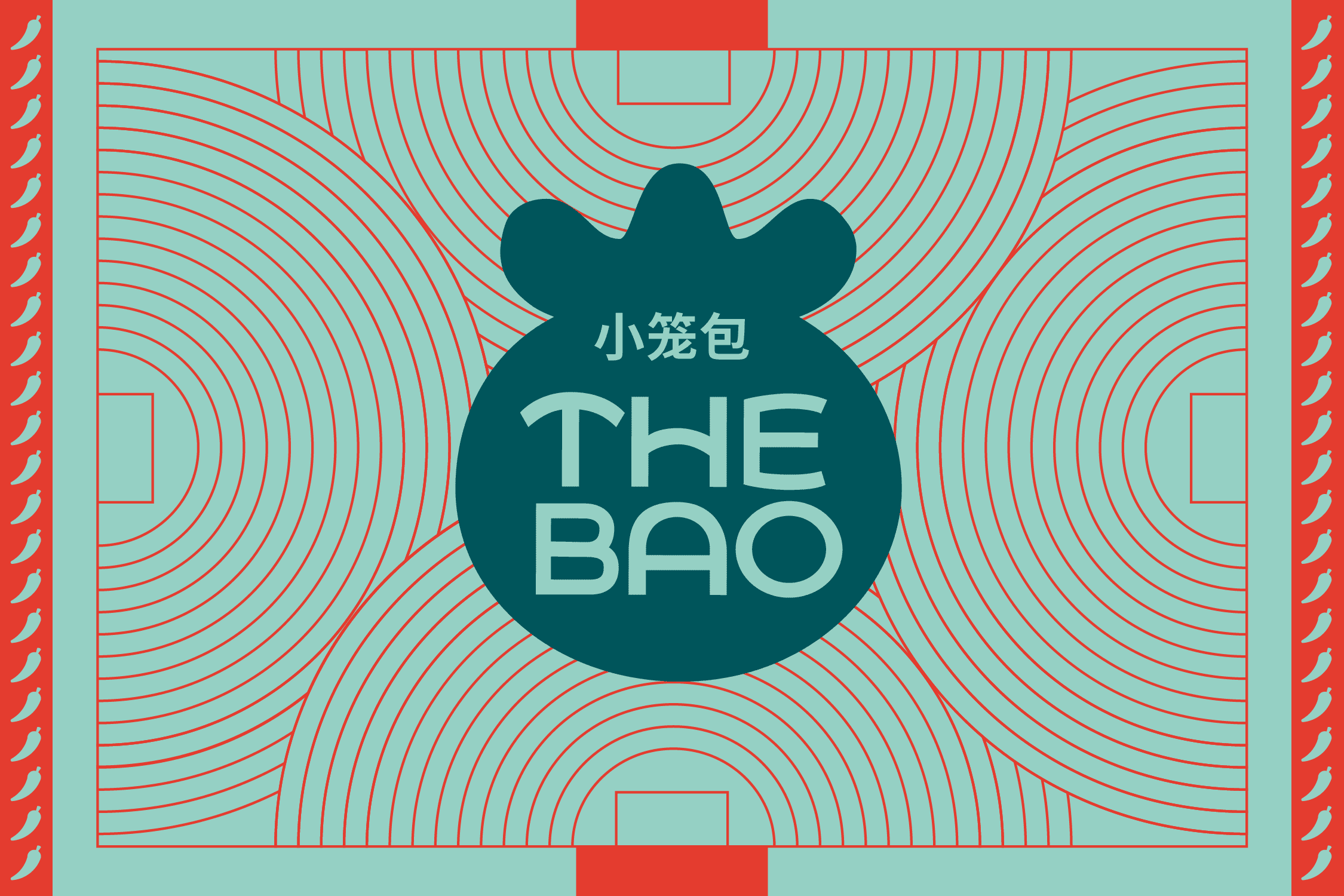
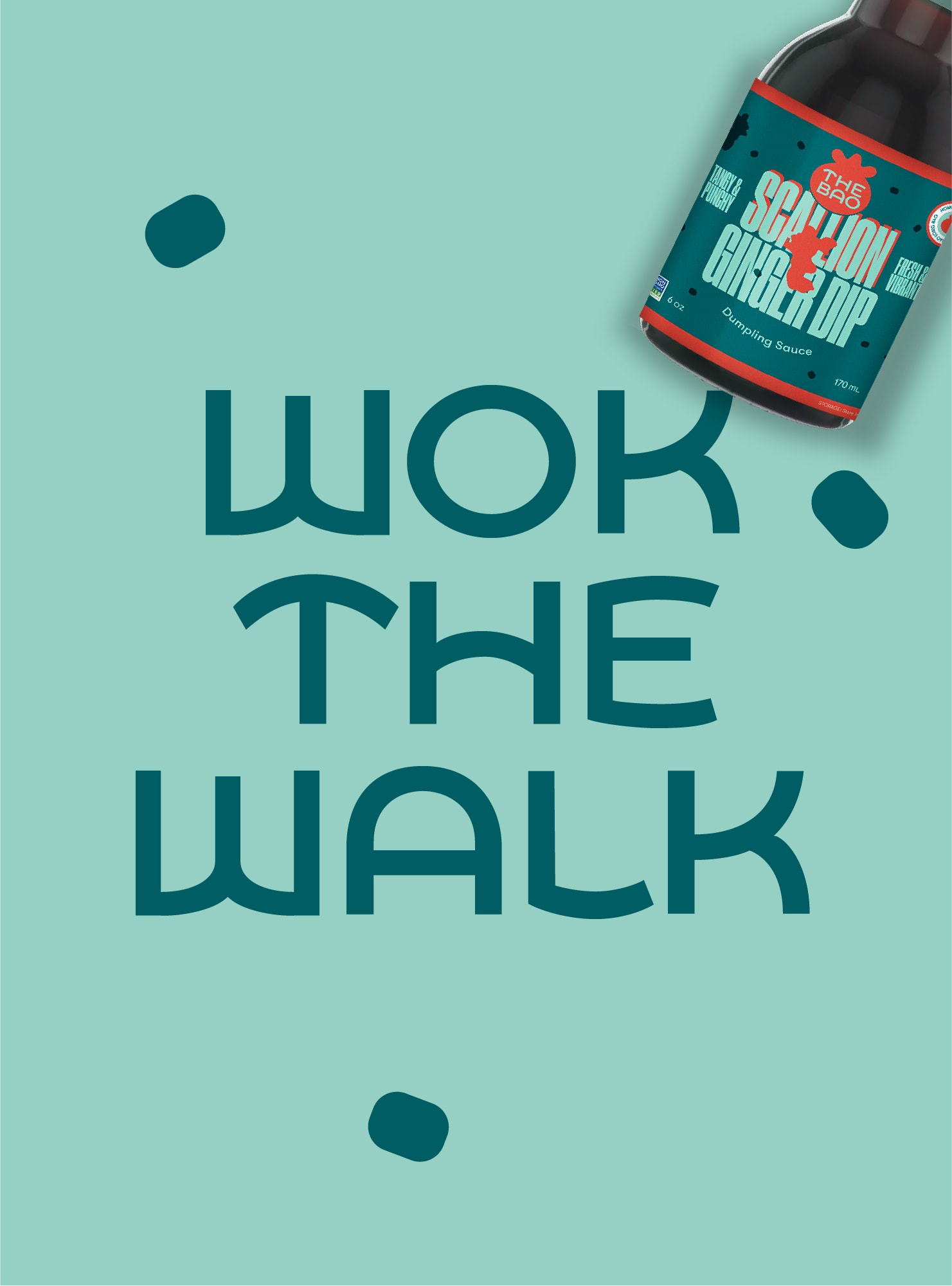

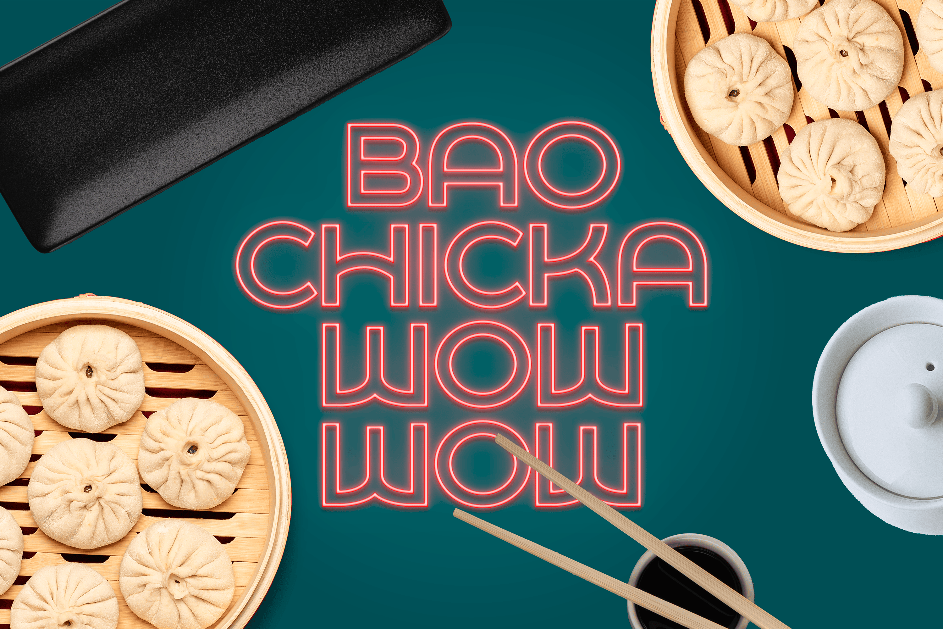

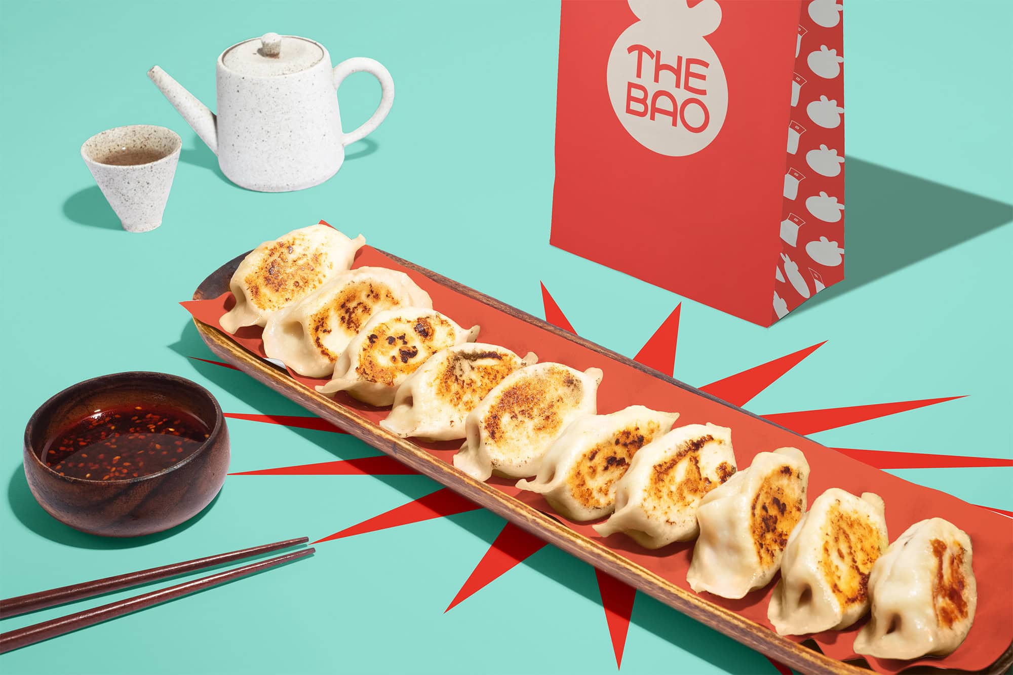

The Bao also launched its signature frozen soup dumplings along with a selection of pre-packaged noodles and house sauces for nationwide shipping.
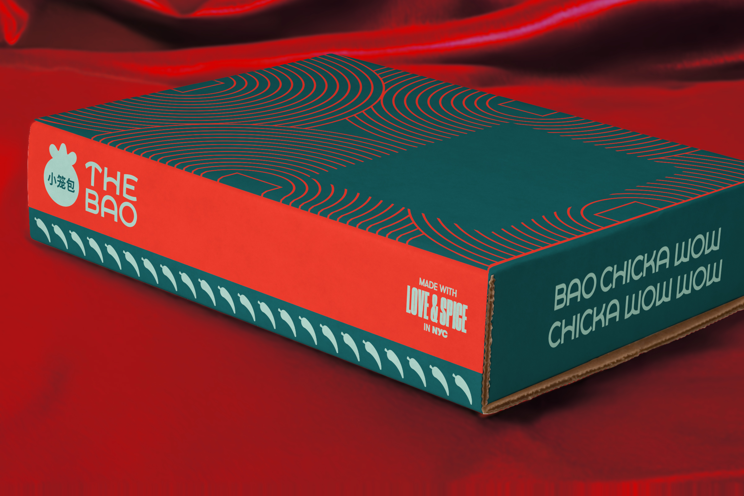
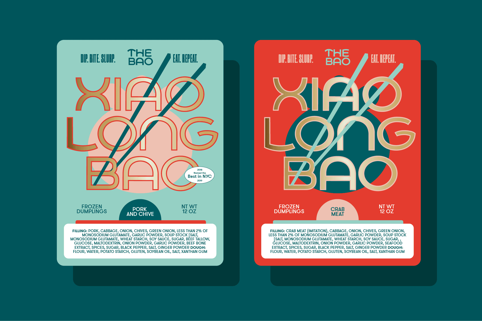
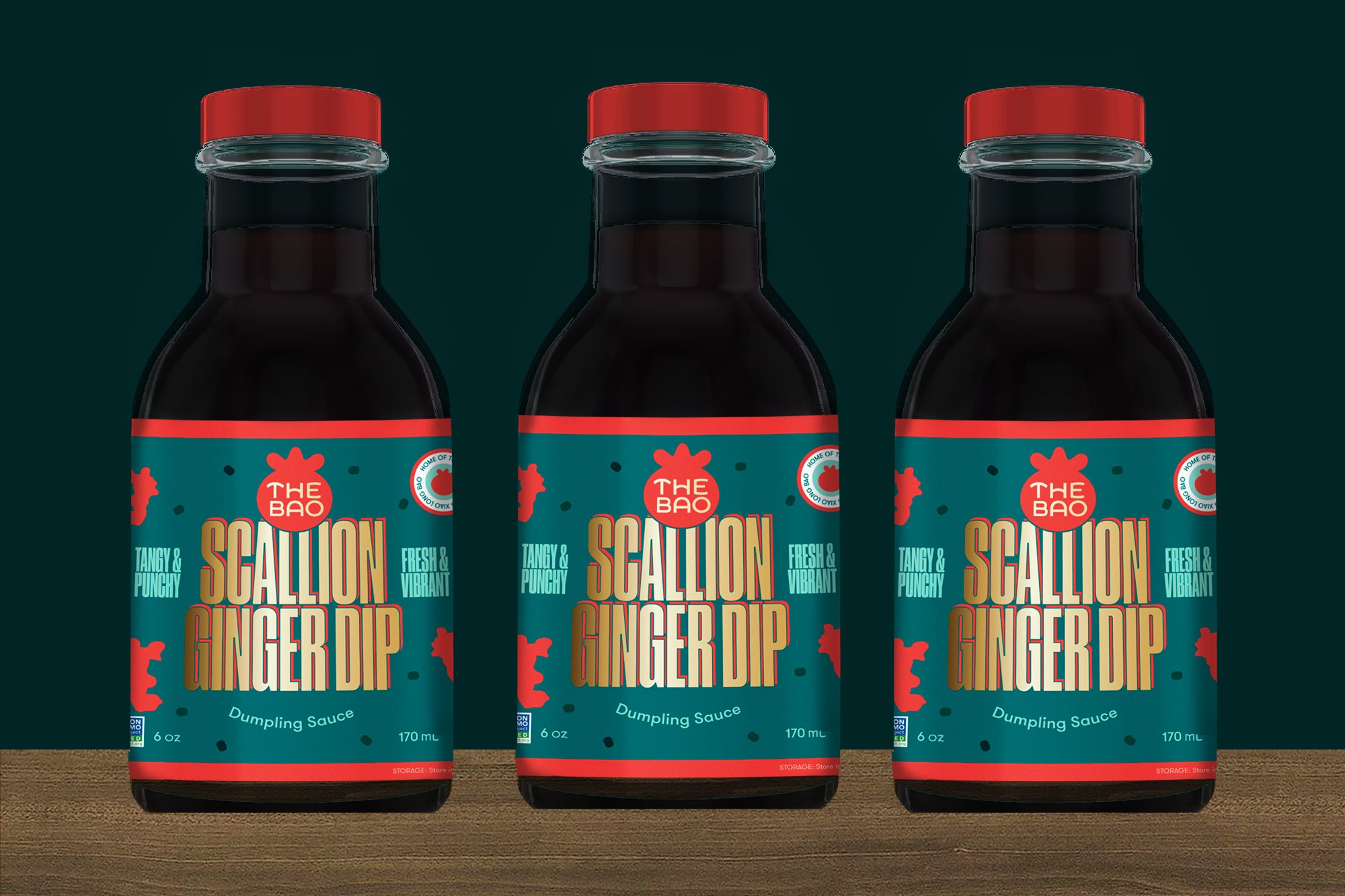
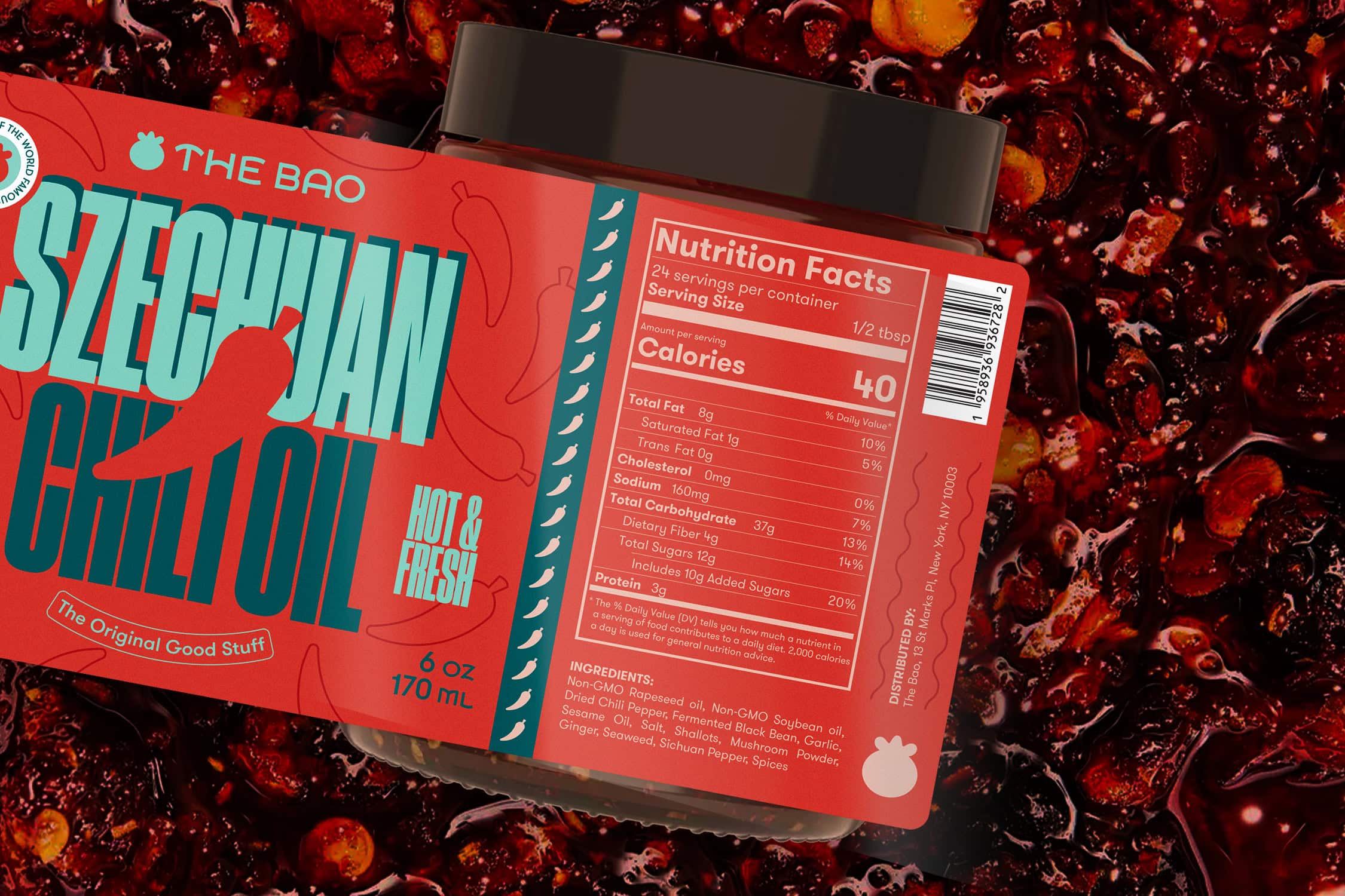

Ecommerce platform for The Bao's line of frozen dumplings, bottled sauces, and dried noodles.
Stay Updated
There are enough emails in the universe, so I solemnly swear I’ll only send you the most exciting updates—quarterly-ish. And by that, I mean once a year when I manage to pull off my end-of-year thank-you’s and fresh case studies.
Developing the creative work that builds the brands and culture of tomorrow.
NEW YORK, NY 10010
ALL WORK © JUSTIN WONG DESIGN and rights reserved UNLESS otherwise NOTED.
Developing the creative work that builds the brands and culture of tomorrow.
NEW YORK, NY 10010
ALL WORK © JUSTIN WONG DESIGN and rights reserved UNLESS otherwise NOTED.
